September 2014
Overall Comments
I was pleased with the overall received comments received from my tutor:
"quite a comprehensive assignment and I can see you have
worked hard on the research of each building which has led to a good selection
of images that take into account the respective buildings’ history and use.
Your choice of buildings is good as each one offers quite a challenge to the
photographer, you have taken your audience into consideration and have produced
a range of shots that inform and illustrate." Tutor September 2014
Feedback from Assignment 3
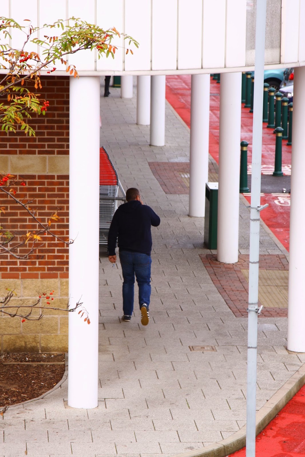
Nottingham Railway Station – My tutor felt that I had captured the "overall design aesthetic of the station" and its alterations making it better for the customer in images 1 and 2. In Image 3 (platform) my tutor suggested that perhaps should have people in the empty foreground to draw the viewer into the image. I understand that people would look better in the image. This is the kind of shot that is probably difficult to repeat because of the positions of the trains, although I will bear the comment in mind for future reference (such as the market square in Nottingham). With image 4, I hoped to photograph someone walking down the stairs on the same side as me, and when people saw the camera they changed staircases. I had been informed by the station that I was not to capture the staff on the platform. At times it felt that at times there were more staff than travellers.
Papplewick Pumping Station – I thought hard about how to show the scale of this building so I was pleased that my tutor thought I had represented the scale. One area I did not show was the man shovelling coal. The reason behind this is that I really struggled to get a good exposure. The chap was moving fast and standing in a very dark area with sun coming through the glass roof, I burnt out the wall behind the chap. Had I have managed a decent exposure, I would have included this shot.
 |
| 1/30 f4 ISO400 28mm |
For my final photograph of this building I chose an image to show the cavernous underground water storage reservoir. I appreciate that using a tripod would work better but time was limited as the tour guide kept us moving.
Southwell Minster – My tutor thought these images showed the atmosphere well. I was pleased with these too, especially as I would normally have taken the image of the altar from a front facing view. Trial and error showed me that this position I adopted worked well and I was interested to note that Todd Hido (2014) (p20) suggests that when one is photographing space, “it is useful
to use the perspective to draw the viewer into the frame. The diagonal line creates
depth, and depth often works well in describing an environment. The diagonal
lines extend your photograph into infinity.” My tutor liked the interaction in image 4 between the visitor and the building.
 |
Powell, M (2014) Sails Ahoy, Good Taste the magazine from Select
Lincolnshire, Autumn/Winter 2014, Issue 20, Warners, Bourne
Photographs possibly Andrew Tryner |
Green’s Mill – My tutor thought that this was another good
choice of building and although I had shown the outside of the building, it could have been more dynamic. I wasn't quite sure how to do this until I was given a copy of a magazine showing Heckington Mill in Lincolnshire undergoing restoration. This had a dynamic image of the exterior of the mill. Once the weather is reasonable, I will try this again. I like the photo opposite as the sails, cap and brickwork contrast against the sky. The angle of the mill makes it appear much taller.
The Collection – I was happy with the images showing the collection, and agree that image 3 of the museum using the the under floor space did not work as well as I had hoped. Also, on looking again, image 4 does look like the exhibits, although what I had tried to show was the was way the space was used and lit.
Belton Orangery – My tutor commented that the exterior
shot was good and gave the viewer an idea of the
buildings location. The following three images were portrait orientation and taken that way because the view was tall and narrow. I felt they worked better that way . I am mindful of the fact that my natural instinct is to shoot in portrait mode and made a conscious effort in Assignments 4 and 5 to use a mix of both. Image 4 was my favourite image which I have had printed large and I am still pleased with it.
Learning Log /
Blog / Suggested Reading / Viewing Pointers
For The Next Assignment
Adding extra navigation made my bog easier to use
To do:
Use a separate page to critically engage with other photographers work
Further reading:
This is a holiday made up of photoshopped images by Dutch photographer Zilla van den Born who fooled her parents and friends by sending them postcard images and posting on Facebook to make them believe she was actually on holiday.
I was impressed at her photoshop skills and I think this is where planning an assignment in meticulous detail really helps. She had researched details such as time zones so she knew when to post on Facebook. The other question it raised was how believable it was - she fooled her family and friends and once the scam was revealed they were shocked that the images were not true. Self obsession is evident as she features on all the images and they are about her. I think the images are more creative than a holiday of selfies as van den Born has considered different poses, scale in relation to the building / landscape and lighting. Would she have got more out of actually taking the holiday? I am not sure. In my opinion, this must have been what she wanted to do because 5 weeks is a long time to pretend you are on holiday for.
"I did this to show people that we filter and manipulate what we show on social media, and that we create an online world which reality can no longer meet. My goal was to prove how common and easy it is to distort reality. Everybody knows that pictures of models are manipulated. But we often overlook the fact that we manipulate reality also in our own lives.” http://sobadsogood.com/2014/09/17/daughter-fools-family-friends-photoshops-her-entire-holiday/?fb_action_ids=10204427026457166&fb_action_types=og.comments accessed October 2014
I enjoyed viewing the images from Molly Macindoe and felt that she projected the atmosphere of the festival to the viewers of the magazine. She states in her blurb that some of the people are people that she is involved with in another project.
http://py-zine.com/post/96212793643/photographer-molly-macindoe-presents-her-exclusive
References
Bibliography
Powell, M (2014) Sails Ahoy, Good Taste the magazine from Select
Lincolnshire, Autumn/Winter 2014, Issue 20, Warners, Bourne (Photographs possibly Andrew Tryner)